Where are they?
You sit comfortably on your couch and pick up your phone. You scroll through the latest TikTok trend, past that funny Reel about Gen-Z humor. You snug into a blanket, ready to dive into the new 20 min episode by 3Blue1Brown on 'Why PI Is Everywhere'. Once on YouTube, though, you get sidetracked by a Short of Elon taking a puff with Joe Rogan, and you end up irritated by a Vox documentary on the Rise to Power of Vladimir Putin. You stop and think: Where are the cute kittens?
In its 18-year history, YouTube has become the undisputed king of online video. As of 2022, YouTube is the second biggest social media in the world, with over 2.5 billion active users, who watch hundreds of millions of hours of content every single day. The company rose like a rocket ship after its founding in 2005 by Steve Chen, Chad Hurley, and Jawed Karim, and was bought by Google 18 months later. Under Google, YouTube went from being a repository of amateur videos to a powerhouse of original content, not to mention a launching pad for its own new brand of superstars, like PewDiePie and the Smosh Brothers. The increase in users is directly proportional to the increasing number of video content uploaded on YouTube. This has become a place for everyone to compete in creating content and earning revenue from ads and sponsors. We will explore the journey of the platform in becoming the second most visited site in the world.
To explore YouTube's trends over the years, we will travel through time using the YouNiverse datasets with anglophone content, this includes metadata of almost 73M videos, each with tags, description, title, number of views, likes and more.
Our idea
We want to focus on the trends over the years of existing YouTube in a format of evolution. To understand where we were and are now. From the nostalgic cute kittens short videos to professional content creators with a global audience and incredible production quality making a real impact on topics like political rivalries, product reviews and scientific education.
Our Analysis
How much content are you actually consuming?
In April 2011, James Zern, a YouTube software engineer, revealed that 30% of videos accounted for 99% of views on the site.
This fact corresponds to the notion of trends. We can in fact see this imbalance as a manifestation of viral content and trends on the platform. So, let's derive this point and look at the timeline of how many percent of videos on YouTube were responsible for 99% of views on the platform for other years.
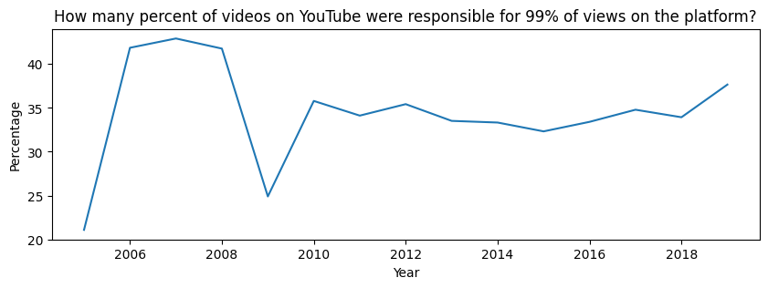
As we can see even in the first years of existing the platform the whole content wasn't covered by the viewers. Here we can see that roughly 35% of the videos are responsible for 99% of the views from 2010 to 2018.
YouTube has a recommendations system which plays a pivotal role across our entire community, introducing viewers to only the slice of the platform that might be most relevant based on their preferences and helping creators connect with new audiences. And you will never see extreme content because YouTube more generally reflects personal preferences that can be seen across their online habits.
We digress...
How did the video length change over the years?
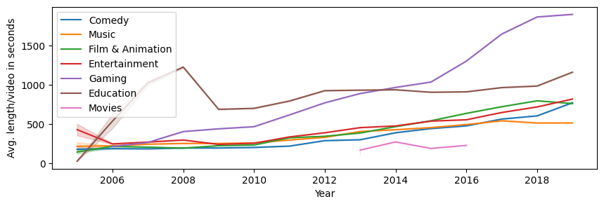
Wow! Everything tends to be longer! The simplest explanation for these swelling run times is a straightforward business. As a study from the Pew Research Center demonstrates, YouTube has been quietly shifting its recommendation system to reward lengthy videos.
Let's now categorize videos based on the duration: less than 2 minutes, between 2 and 20 minutes, and more than 20 minutes (corresponding to the actual filters in YouTube). The following plot shows the contribution of videos with different duration to the total amount of views on YouTube.
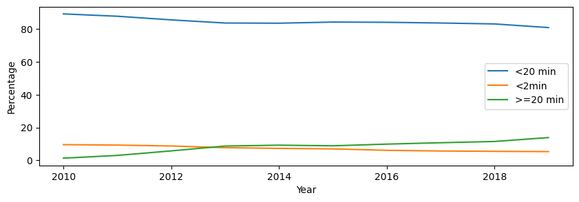
The videos that have a duration of less than 20 min prevail over the other videos, but there is a tendency for the longer videos to dominate the really small ones starting from 2013. We assume that this increasing gap between short and long videos after 2013 might be the reason why TikTok became so successful nowadays.
What can reveal positiveness in the content?
The classification of positive and negative content becomes very important for the YouTube user to assess how meaningful the content that has been published is based on user opinion. A large following on a YouTube channel gives enough power to the content creator to manipulate the video and reach a thousand users.
Performing sentiment analysis on the titles of the videos, we got the following results over years:
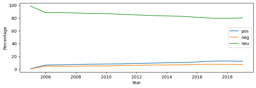
A large number of neutral titles is due to two main reasons:
- The assumption that we made where titles with 'compound' value between 0.5 and -0.5 are considered neutral. The higher the margin, the larger the number of neutral headlines.
- The titles of the video usually meant to be neutral.
The positive content prevails over the negative content over the years.
Let's dive deeper into words that are either positive or negative in titles. We try to find the most common in both categories over the years.
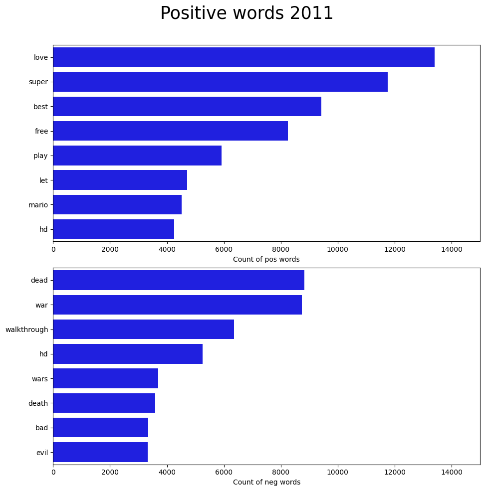
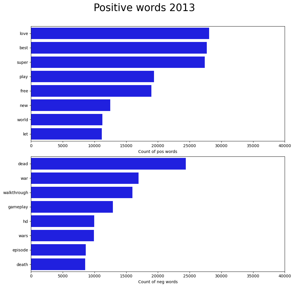
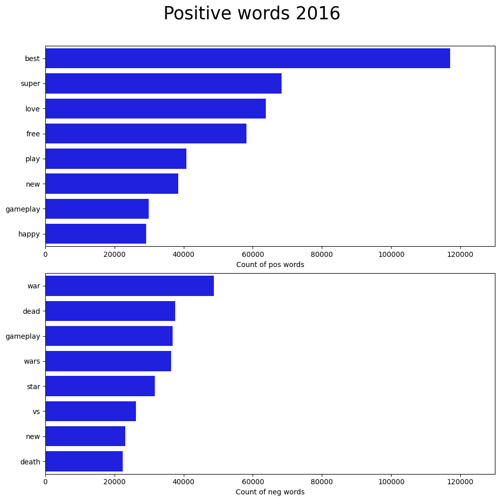
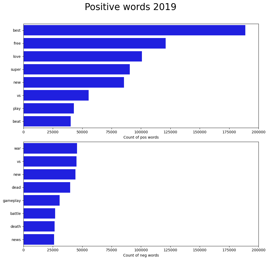
The negative words haven't changed much over the years but as we can see their usage have been increasing steadily. The same also goes for positive words. This could be attributed to the growth in Youtube and the magnitude of uploads being performed every year.
Does the category precisely describe the video? How are the videos and categories connected?
YouTube has always fascinated us with its incredibly vast library of content that rapidly changes over the years. Trying to zoom out and visualize the content ecosystem as a whole may help us to derive the proper conclusion out of the platform and creators there. Seeing the broad scope of communities and connections at scale may also be a powerful tool for understanding online behavior.
We are aware that the category attribute is too broad and consists of various topics. However, choosing the right category will help in the promotion of your video to the target audience. Nevertheless, we use YouTube tags which are words and phrases used to give YouTube context about a video. Moreover, tags are considered an important ranking factor in YouTube's search algorithm.
So, we decided to dive into the tags to be able to explore the topic space of Youtube more precisely.
What words do the creators pick to describe the content?
Let's look at the most popular tags for some years.
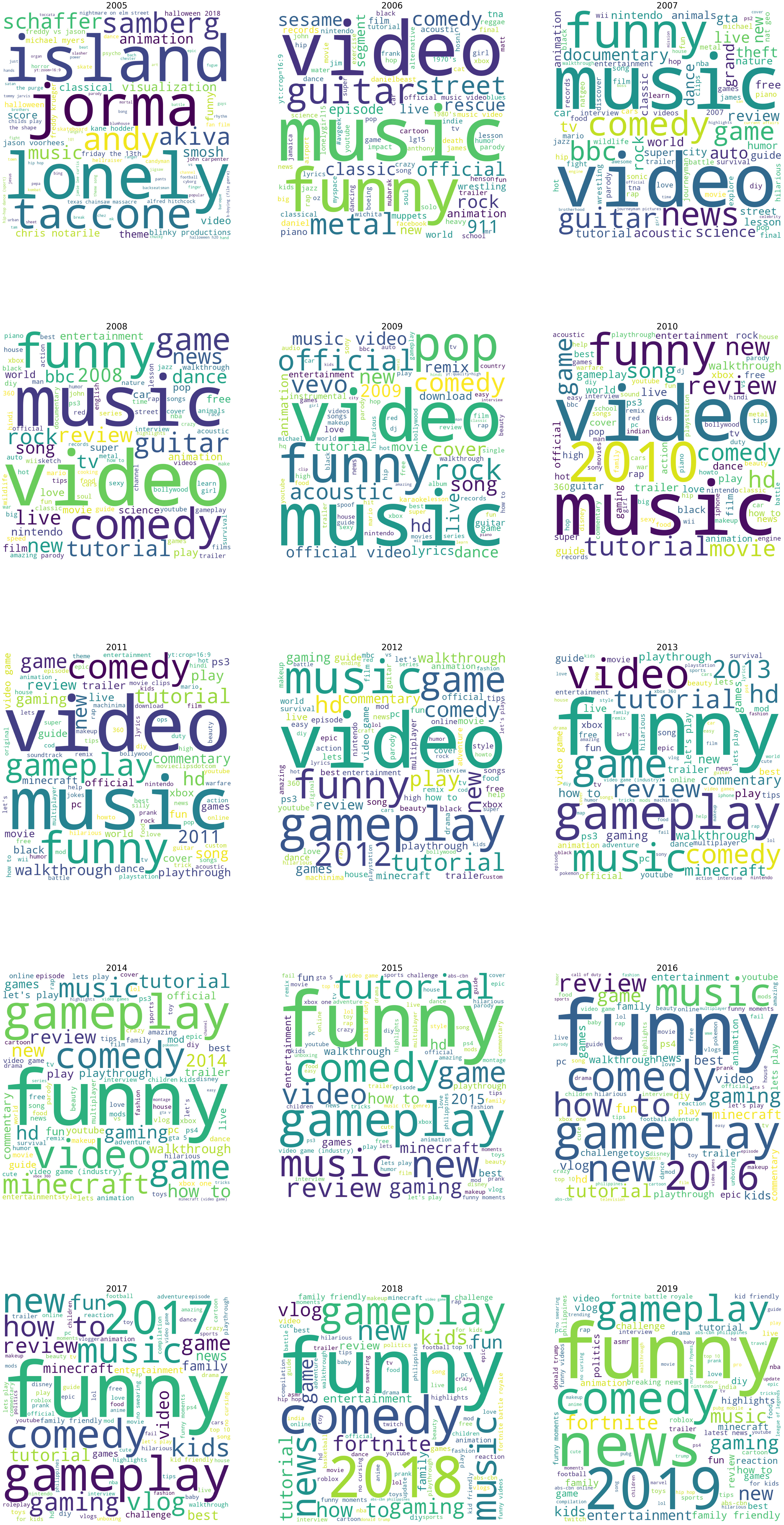
We are taking into account the most viewed videos that show us the main topics for each year. WordCloud shows us pretty interesting results. The hottest topics over the years seem to be Funny, Music, News, Comedy.
We want to compare our results to the search in YouTube with GoogleTrends. And see the supply and demand.
For the "Funny" tag we can see that it was a big part of Youtube since 2006 and remained extremely popular for all time periods. But looking at the search tendency, it becomes obvious that people’s interest in it is constantly decreasing.
Regarding "Music", we can observe that roughly speaking, the search and posting videos tendencies overlap, and the peak in 2011 is common for searching and posting. For "News", the tendency is that content (increased in 2017) is trying to follow the demand (started in 2016) we can see in searches. The first demand, then supply.
Looking at the "Comedy" tag, a lot of content was produced far earlier (since 2006), and then people started to search for it (2017).
As we can see Minecraft has been gaining popularity until it reached its peak in 2014 and then starting going down. Later we see fortnite strating to take over so far peaking around 2018. This information can be seen across both the wordclouds we provided for the tags as well as youtube trends.
The same results can be obtained also for descriptions
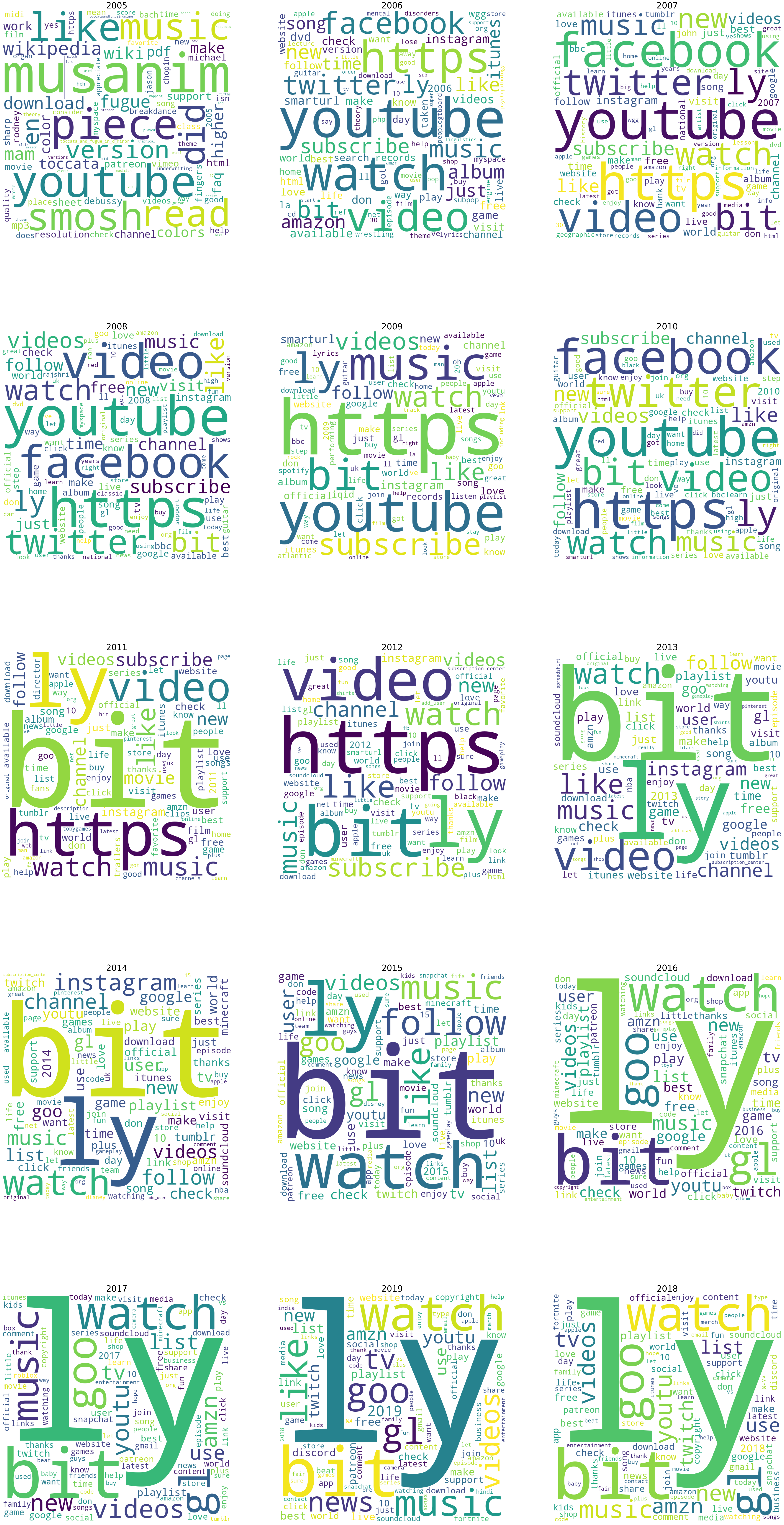
We can see from this plot that descriptions rather provide external links and other social media platforms despite the tags. Because of that, we can't extract much meaningful information about the content, but it would be interesting to explore the usage of mentioning other platforms in the descriptions.
Since 2006 Facebook and Twitter have been extremely popular and equally frequently used by creators until now. But we can't see it in the plot because we are filtering out very popular words to get more meaningful information. Starting from 2010, URL shortener services dominated the descriptions.
Also, when Instagram was launched in 2010, it immediately appeared in the descriptions of creators. Soon, in 2015 Instagram disappeared from our Word Clouds, so we can state that in that year it became a well-known practice to add an Instagram link to the video description.
Graph
What would an atlas of YouTube look like?
Replicating the process for YouTube, a much larger platform, was no easy task. Since we are discovering trends, we would like to consider only 1% of YouTube videos per year ranked by view count, which is reasonable due to the extremely high amount of videos uploaded each year and the variety of categories among this 1%. We found our answer by looking at the graph that consists of nodes as videos and edges as common tags. By collecting these tags and comparing them across all videos, we could build a graph of video relationships.
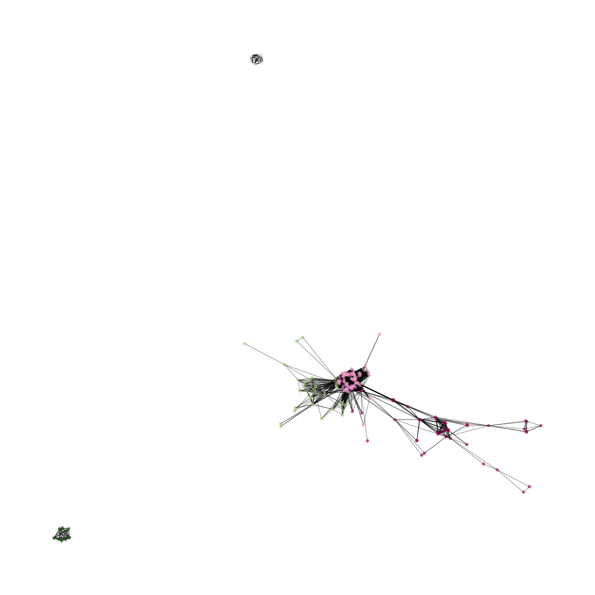

How to read this graph:
- Each node is a single video
- There is an edge between two videos if they have common tags
- The color of the nodes represents the community of the videos made by the Louvain algorithm
The atlas shows the top 1% YouTube videos per year ranked by view count. What insights would this type of visualization hold?
Exploring the centrality of the 3 largest graph components we might find the most viewed videos of the specific year. Here we have the most important node in each community:
Year 2009 (2/3 Indian movies)- Dave Matthews Band - Satellite
- Saudagar - 1/13 - Bollywood Movie - Nutan, Amitabh Bachchan & Padma Khanna
- Vivah - 14/14 - Bollywood Movie - Shahid Kapoor & Amrita Rao
Year 2012 (2/3 Videos about games)
- HOW TO LIE (Trouble in Terrorist Town)
- Minecraft - Cats & Kittens! (Patch 1.2 pre-release 04a)
- How To Make Water Explode!
Year 2015 (2/3 Videos for kids)
- Dinosaurs A to Z | NCT DREAM Challenge | Dinosaur Songs | PINKFONG Songs for Children
- MINIONS PUSH POPS or cake shooters how to craft or baking by Charli's crafty kitchen Despicable Me
- EASTER GONE WRONG!!
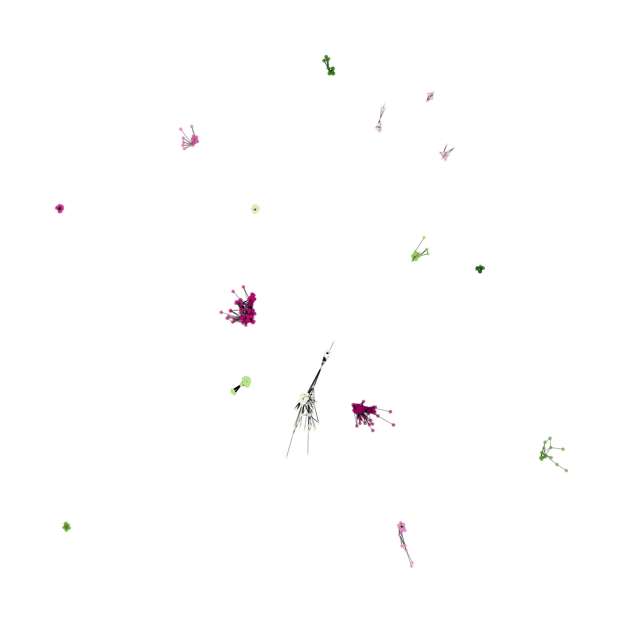
Circle Graph
We wonder if the videos are described in both tags and categories but the most explicit is the information of the tag: how the categories are connected among each other in terms of tags?
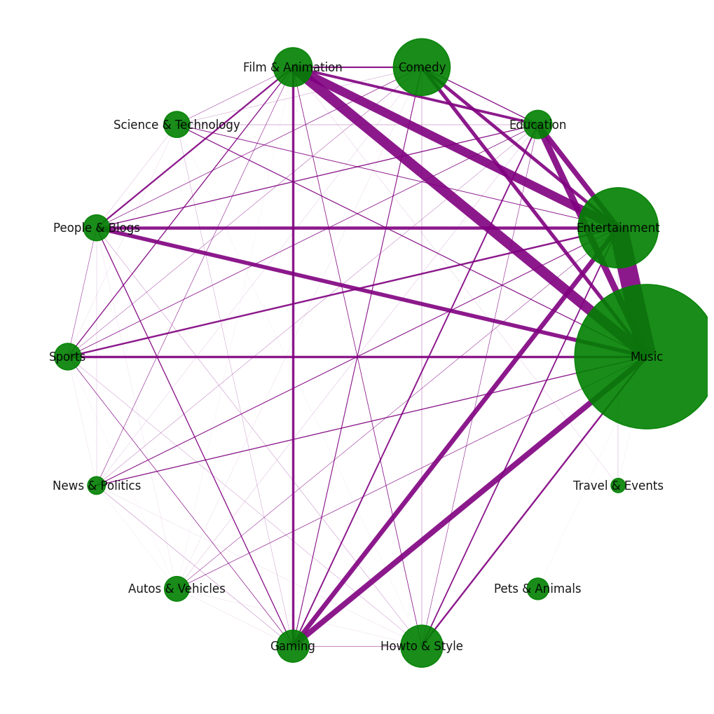
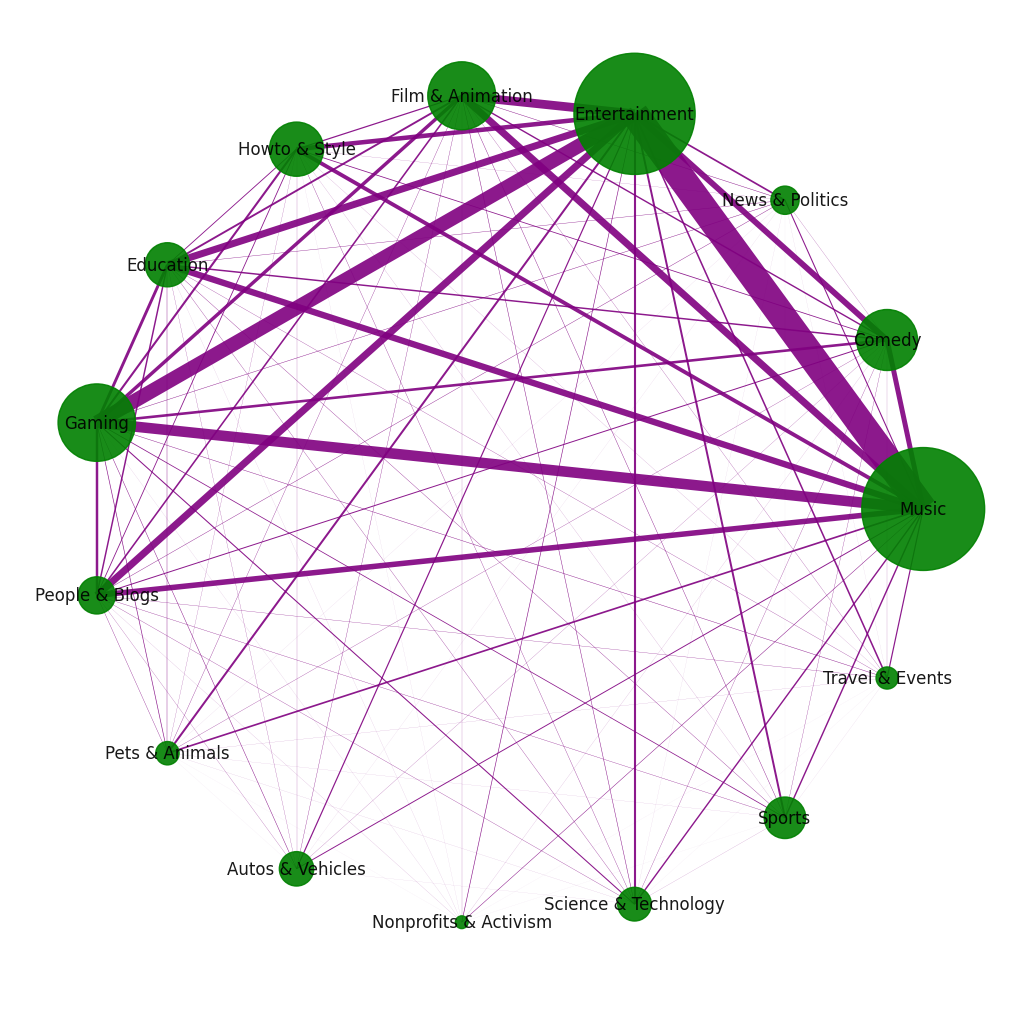
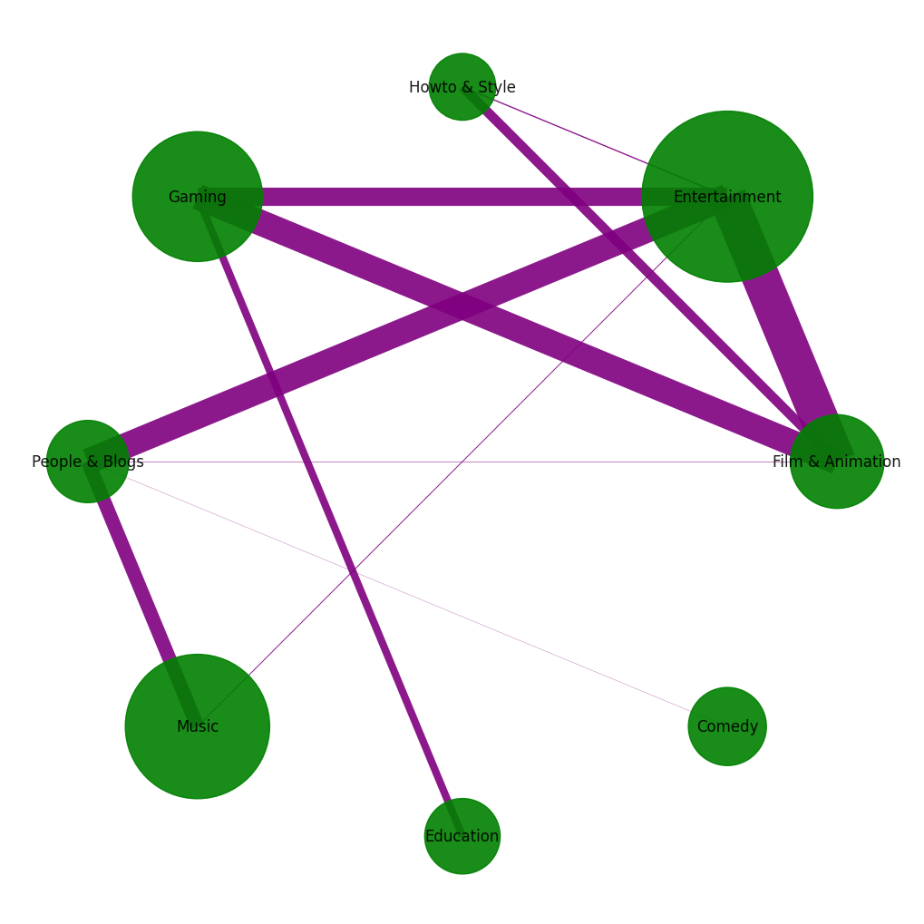
Using the previous graph with the strongly connected videos, we displayed the following plots of interaction between the categories. Where the node is the category, and the size of the node is proportional to the number of videos in this category. The circle graph is weighted and depends on the number of connections.
The results tell us much about the content of the platform.
- In 2009, having only three components in the graph, the relation between categories is highly weighted and frequent. Which can be described by the amount of connected videos in the largest component.
- In 2012, there was a transparent transition from 2009 in the sense of the division into components but with remaining the relation between categories. We believe that there are components that contain many categories, which gives us the confirmation of interconnected decentralization
- In 2015 there are more disconnected components and less interaction between categories, which gives us thoughts of a mixture of different topics inside the specific category that aren't associated with each other and further categories. Here we can observe poorly connected decentralization.